

New York

Hi there, Fanatics! Today marks the grand start of a new series on The Flag Fanatic that I have aptly named, “Flag Redesign”. This series will focus on current or historical flags that I will attempt to redesign.
Have you ever walked by a state or city municipal building and noticed the flag flying next to the building? I would guess that you don’t, and that’s a problem! One should be proud of the flag that represents their community. My aim is to give these flags an uplift and redesign that residents can look at and say, “that’s a great flag, and that’s ours!”
And what better way to do so then by picking on the easiest targets, American state flags! With a few exceptions, most state flags are forgettable. The popular phrase in vexillology is “seal on a bedsheet”, which means a flag whose design consists of a state seal with a solid color background. I, myself, think that phrase is a bit too harsh: state flags with the seal are historical and have been around for many years. However, I do agree with the phrase’s underlying message: these state flags are forgettable and are indiscernible from a distance. And that is my reasoning for selecting a U.S. state for the first post of “The Flag Revision”.
Today’s redesign will be the flag of the state of New York. Let’s take a quick look at the current flag:
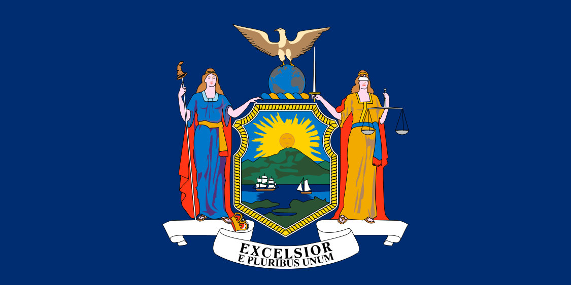
A lot is going on here. The center of the flag is the seal of the state of New York. You can read more about the symbolism of the seal here. The seal (and flag) actually changed slightly in 2020, with the addition of the phrase “E Pluribus Unum”, Latin for “out of many, one”. While the seal is neat on its own, needless to say, it’s a bit too much for a flag.
So let’s dive into some of my suggestions for a better flag for New York. I decided to keep the current flag’s 1:2 proportion in each of my creations. The most difficult part of this endeavor was determining the symbolism of the state. My attempt was to avoid deciding on something that represented the city of New York rather than the state as a whole. I hope my below designs live up to that goal.
We will start off with my first design: “Sunrise.”

No, this isn’t the Rising Sun flag of Japan; it’s a representation of the rising sun from the seal of New York. I purposely drew the sun to resemble the Statue of Liberty’s crown.
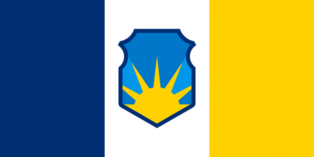
This second design works off of the sunrise, but I placed it in the shield of the seal of New York. The background of the flag are the colors of New York, blue and gold, on the hoist and fly, respectively.

This third version of the sunrise has the sun inside the seal, but this design utilizes a vertical triband of (from hoist to fly) blue, white and gold.
And the fourth version of my sunrise design: the same vertical triband as before, but gold-blue-gold. The seal’s border is also white instead of blue.

My second set of flags follow one iconic symbol: the torch of the Statue of Liberty. You are probably thinking, “Didn’t you say you were trying to avoid symbols that represent NYC over New York State?” I don’t deny the Statue of Liberty’s importance as a symbol of the city, but I argue that the Statue of Liberty goes beyond the city: it represents the welcoming of hard-working individuals dreaming of freedom, opportunity and a new life in this great nation: a promise of a better future. It’s something that all residents of The Empire State can proudly boast as their symbol of hope and liberty.
With that, let’s move on to the “Liberty Torch”. The first two are quite similar in background to what we saw with the sunrise, only the seal is replaced with my design of the Statue of Liberty torch.


This third design harkens back to the current flag of New York: the torch sits on a blue background. There is definitely a resemblance to the flag of the state of Indiana: a compliment or criticism, depending on your opinion of this flag.

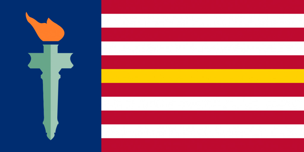
The next two go for a more typical American style of flag. I am still using the torch as the main piece, but, in these designs, the torch sits on the hoist side of the flag on top of a blue background (with a length of a third of the flag). The remaining two-thirds of the flag is given the iconic horizontal stripes. In this design, I used 11 stripes, representing New York as the 11th state of the union. The left flag goes with gold and white stripes. The right side uses red and white stripes, but with a single stripe of gold, representing New York.

The last version of this striped flag is the same as the one above, but with 13 stripes, representing the original 13 colonies, and one stripe in gold, representing New York.

And that is that! I apologize for the unimaginative names of my flags. I would absolutely love to hear your feedback on my flag designs. You can take the poll below and vote on which flag you liked the most (or if you didn’t like any of them at all; I won’t be offended!).
Thanks for reading!