


Nepal

Welcome back, fanatics! If this is your first time reading this blog: hello! The Flag Fanatic is a site I created where I discuss flags from around the world, both current and historical. The post you are reading (currently dubbed “The Flag Review”) takes a look at a flag’s design and history. In my first post, I discussed the origins of New Mexico’s flag. If you haven’t read it already, I would highly recommend you check it out!
For today’s post, I’ll be moving on to a national flag (and one that is extremely unique in the international sphere): the flag of Nepal.
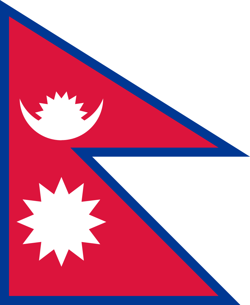
You might have come across this flag at one time, whether it was looking over a laminated poster of flags of the world or visiting New York City and passing by the UN. What makes the flag of Nepal unique is that it isn’t a square or rectangle. In fact, it’s the only national flag in the world that fits this definition. The flag consists of two pennants, one on top of the other, with a slight overlap. It is said that the pennants represent the Himalaya Mountains, which would make sense, since the mountain range makes up most of Nepal’s geography. A blue border on the flag wraps around the crimson pennants. The color of crimson is a symbol of bravery and represents a rhododendron, the national flower of Nepal. Within each pennant is a charge in white. The top pennant contains a crescent moon while the bottom contains a sun with twelve rays. It is believed that the charges represent the two major religions of Nepal, Hinduism and Buddhism.
A lot of guessing surrounds the flag’s symbolism. That’s because there isn’t much information on its origin. Variations of the flag have been used throughout the country’s history. It’s current design was adopted into law by the government of Nepal in 1962.
Now for my opinion, which is why you are reading this in the first place, right?
The flag of Nepal is a great example of how designs don’t need to follow the norm to be good. Its uncommon shape and minimalist design perfectly captures Nepal’s cultural and geographical identity. However, it’s non-quadrilateral shape (meaning it is a figure that does not have four sides), does have its downsides. The most apparent to me is when hoisted on a flagpole. With the flag’s length being shorter than its width (the length of a flag is the flag’s horizontal ends, perpendicular to the flagpole), it can appear quite small when it is flying next to flags of other nations (or be hidden behind them, altogether).
For me, a flag should serve as a clear, visual representation of a place and/or people. The flag of Nepal’s unusual design might create situations where it gets lost in a crowd of flags, but it does a great job of representing its country and people and doesn’t overwhelm the viewer with distracting seals. In other words, it’s unique, but not ostentatious: qualities of which all flags should strive.
Thanks for reading. If you have any flag suggestions for the next post, leave a comment below!
Sources
Central Intelligence Agency. (2021). Nepal. The World Factbook 2021. https://www.cia.gov/the-world-factbook/countries/nepal/flag
Constitution of Nepal. Part-1(8). (2015).